Formular

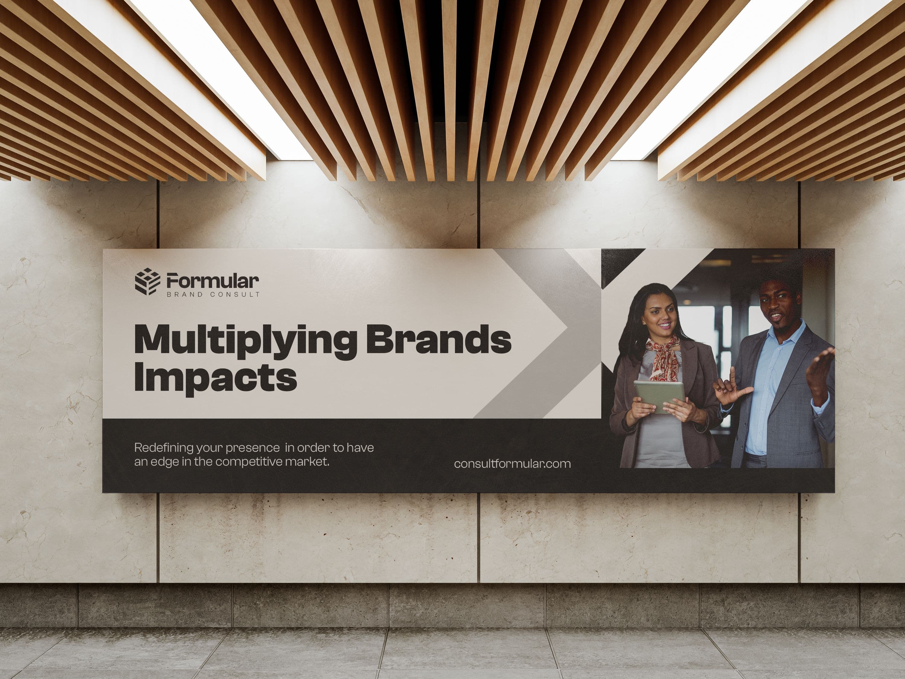
Formular Brand Consults is a strategic consultancy firm dedicated to delivering problem-solving, innovative strategies, and structured brand solutions. With a focus on logic, precision, and multidimensional thinking, the brand aims to provide businesses with calculated, formula-driven solutions that...

ClientFormular
Description

Strategic consultancy firm

Category

Web Design, Branding

Brand Identity & Application Beyond the logo, Formular Brand Consults’ identity system extends seamlessly across various brand assets, ensuring consistency, recognition, and professionalism. Whether applied to business presentations, stationery, digital platforms, or marketing materials, the identity system reinforces the brand’s promise of structured innovation and strategic problem-solving.
The Cube Symbolism: Represents structure and organization, reinforcing the brand’s commitment to methodical, well-reasoned strategies. Aligns with the concept of formulas, reflecting logical problem-solving and calculated decision-making. Serves as a metaphor for strategic depth, showing how Formular analyzes challenges from multiple perspectives. By incorporating the cube into the logo, the brand identity effectively communicates expertise, precision, and innovation, ensuring that every aspect of the design aligns with Formular’s mission.
Impact & Future Vision With its carefully crafted logo and cohesive visual identity, Formular Brand Consults now possesses a strong, recognizable brand foundation that sets it apart in the consultancy space. The cube-inspired logo, paired with the refined neutral palette, solidifies the brand’s positioning as a trusted partner for businesses seeking structured, innovative brand strategies.
This identity system not only establishes instant credibility but also ensures long-term relevance, allowing Formular to grow and evolve while maintaining a consistent and powerful brand presence.
To enhance the professional and timeless nature of Formular Brand Consults, a neutral color palette was carefully curated. Each tone was selected to reinforce the brand’s credibility, trustworthiness, and modern sophistication:
Beige – Represents warmth, reliability, and approachability, ensuring the brand remains inviting and personable. Woodsmoke – A deep, rich tone that conveys authority, intelligence, and strategic thinking. Silver – Symbolizes clarity, modernity, and a forward-thinking approach to branding solutions. Gallery (Soft Gray) – Adds balance and versatility, ensuring the brand maintains a refined, professional appearance across all touchpoints. These neutral hues work in harmony to create a sleek, sophisticated identity that is both timeless and adaptable, ensuring longevity in an ever-evolving business landscape.